OxLEP Brand Update
A reimagining of the three OxLEP brands has helped them to better connect with their audience and boost brand recognition.
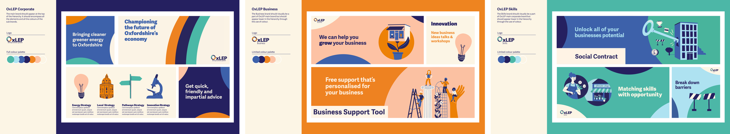
A review of the existing identity for the main OxLEP brand and two sub brands, OxLEP Business and OxLEP Skills, revealed that while their offering was great, they were suffering from inconsistency and a lack of brand recognition. There was also a strong feeling that the existing branding was feeling too corporate and formal to properly connect with their customers and stakeholders.
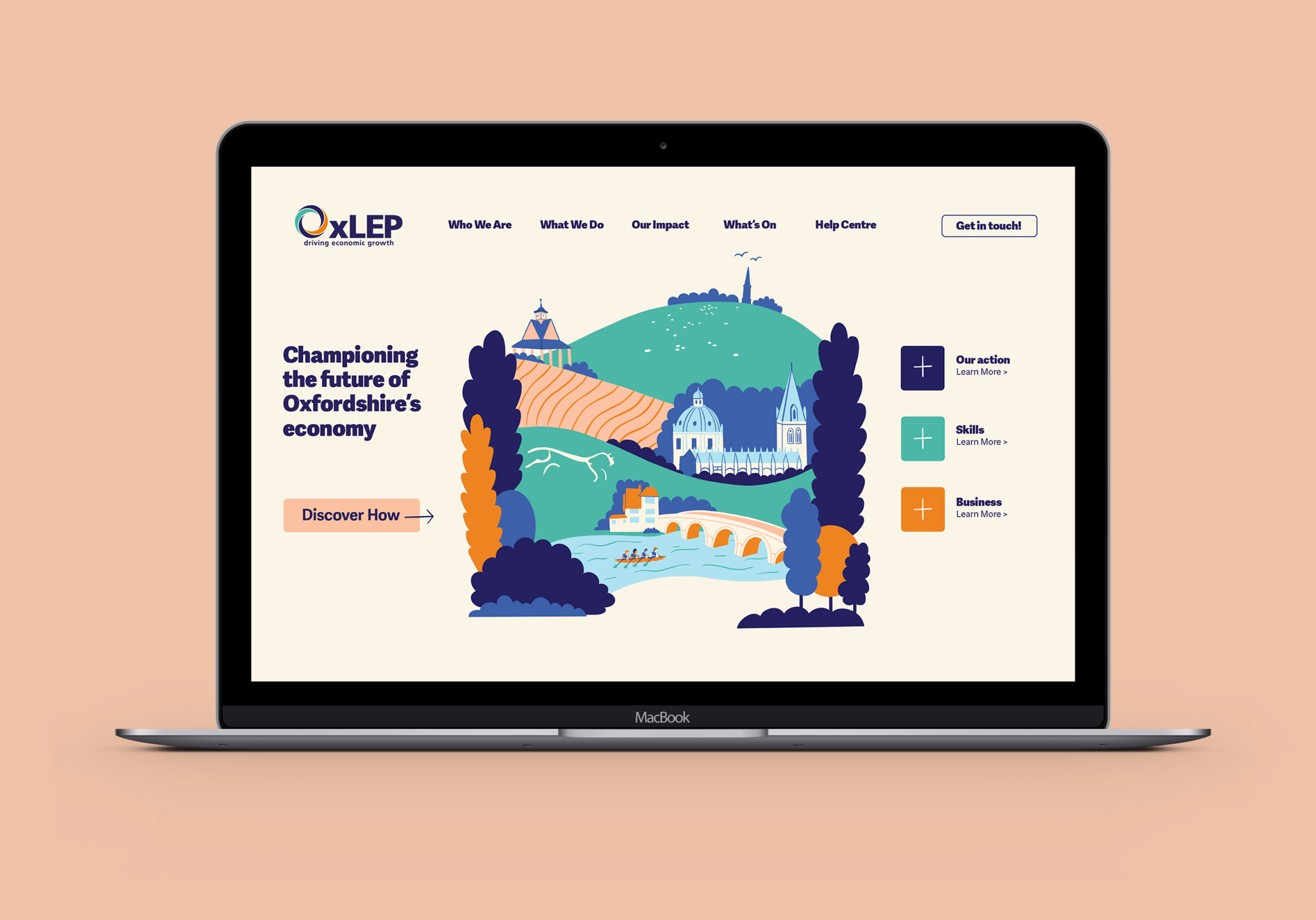
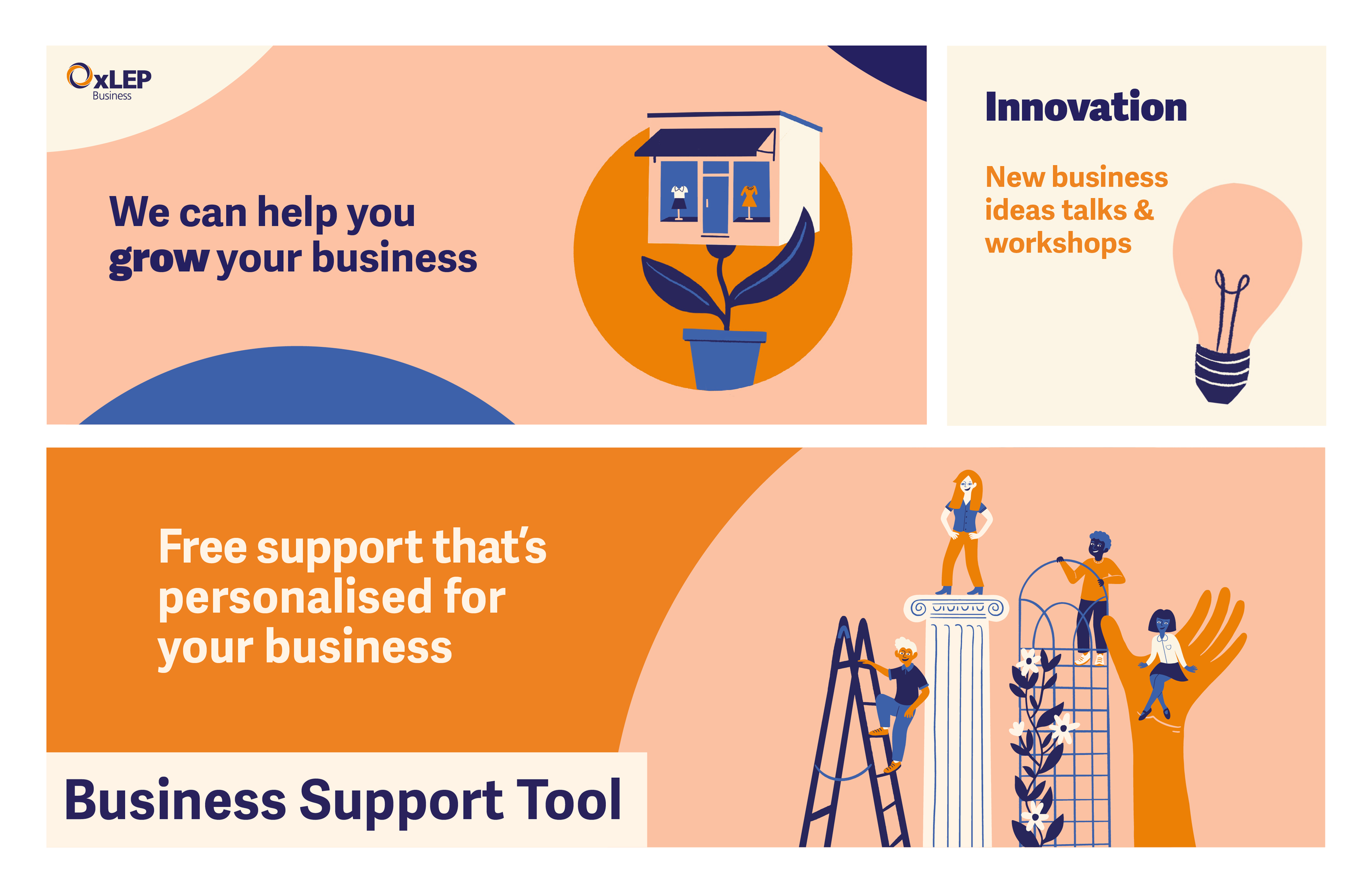
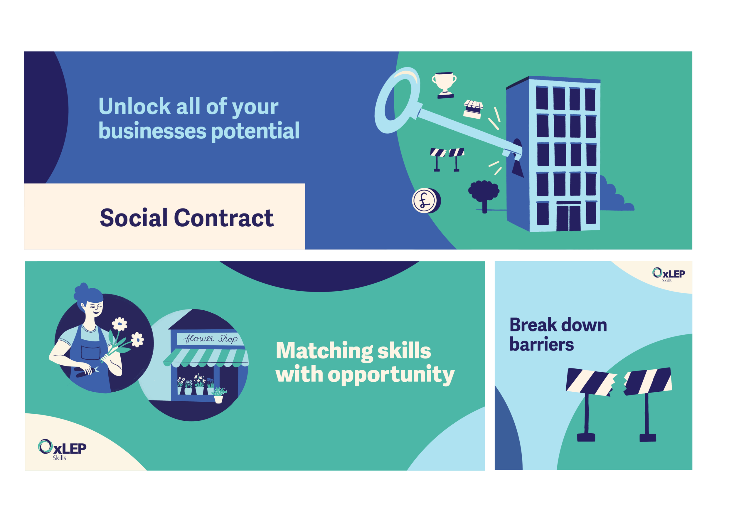
Building on the brand’s core assets I extended the colour palette to allow for more flexibility whilst still reinforcing the existing sub brand split and making it feel softer overall. I introduced rounded shapes as design elements to further soften the look and to reflect the logo mark. And I created a set of bespoke icons and illustrations to add personality and increase engagement.
-
Client: OxLEP
My Role: Creative Direction, Brand Design & Illustration